
BRAND KIT
Use this brand kit to ensure that all Terence Crutcher Foundation communications use a consistent style and tone.
COLORS
Click on any color to copy its hex code to the clipboard.
FONTS
THE NEUE BLACK
The Neue is used for headlines. Any time this typeface is used, it should be used in all caps. As a general rule (with some exceptions), it should rarely be used for information outside of a headline. One exception to this rule would be when you need typography to be more visual, and it is the only thing on the page / screen (e.g. a long quote that is full-screen).
Try It Out
Download
Gräbenbach
Gräbenbach is the body font for Terence Crutcher Foundation. It should never be used larger that 11 pt. in print or 18 pt. on the web. Since this is the body font, it should not be used for headlines.
Font Styles
Try It Out
Or click a style above to download individually.
Gräbenbach Mono
Gräbenbach Mono is the fixed character width version of the body font, Gräbenbach. It gives an intellectual typewriter feeling to the brand. It should be used for subheadings, callouts, charts, infographics, and anything where lots of number are being compared at once.
Font Styles
Try It Out
Or click a style above to download individually.
LOGOS
All logo assets have transparent backgrounds. If you're unsure which file format to use, it's probably best to use PNG, unless the PNG image is too small for a large graphic. SVG files are vector graphics, so they can be used at any size, but some platforms do not support them natively.
Or download a PNG or SVG image with the buttons below.


HEADSHOTS & BIOS
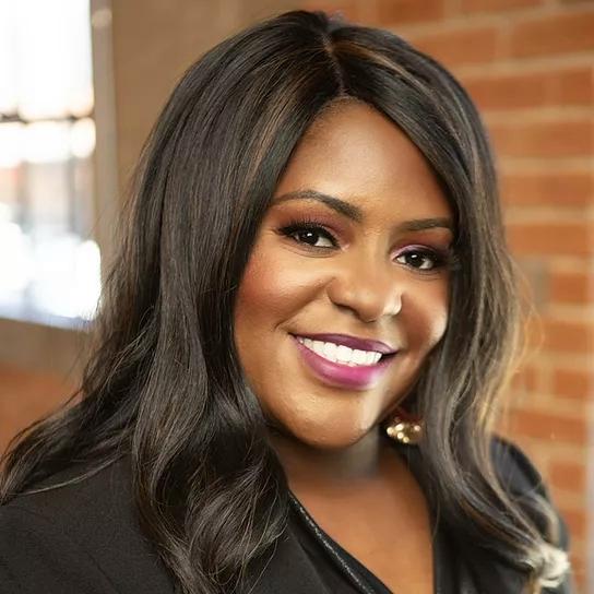
Dr. Tiffany Crutcher
Cofounder & Executive Director
Dr. Tiffany T. Crutcher is a native of Tulsa, Oklahoma who was thrust into the international spotlight following the death of her twin brother, Terence Crutcher, who was shot by a police officer in Tulsa, Oklahoma, while holding his hands in the air. The murder of her brother compelled Tiffany to speak out against police brutality, particularly the killing of unarmed black men. She has chosen to turn her personal tragedy into an opportunity to bridge fear, mistrust, and help transform a justice system that has long perpetuated injustice dating back to the 1921 Tulsa Race Massacre where mobs of white rioters burned down her great grandmother’s prosperous community known as Black Wall Street. Dr. Crutcher has remained committed to organizing coalitions throughout the country that promote the interests of minority communities. Crutcher is the Founder and Executive Director of the Terence Crutcher Foundation, Demanding A Just Tulsa Coalition, and The Tulsa Black Mental Health Alliance. The foundation’s primary focus is criminal justice and policing reform, honoring the legacy of our ancestors, policy advocacy, and strengthening communities through youth prevention and economic development. Crutcher is a proud HBCU Graduate, a graduate of the James W. Wright Leadership Development Institute in Montgomery, AL, and recently received a certification in Leadership, Organizing, and Advocacy from Harvard Kennedy School. Dr. Crutcher currently serves on the Oklahomans for Criminal Justice Reform, Historic Greenwood Mainstreet, Justice for Greenwood Foundation, Thunder Fellows, and Black Tech Street Boards of Directors and Advisors. She is a proud member of Alpha Kappa Alpha Sorority Inc. and serves as a member of the United Justice Coalition, the NFL Racial Equity & Social Justice Council, Groundwork Project, and a founding member of Sisters of the Movement, all National organizations. In 2018, Dr. Crutcher created the Tulsa Community Remembrance Coalition in partnership with Mr. Bryan Stevenson and the Equal Justice Initiative (EJI). This vital partnership is committed to changing the narrative about race in America. To date, Dr. Crutcher has erected two historical markers in the historic Greenwood district and invited the 46th President of the United States, Joseph Biden to Greenwood, the first sitting president to acknowledge the Tulsa Massacre in 100 years. Crutcher has been the recipient of many awards and honors; Crutcher was named a 2020 Tulsan of the year and recognized by the Oklahoma City Thunder Basketball Organization as a Changemaker in the state of Oklahoma. In October of 2020, Crutcher was awarded with a grant from The Black Voices for Black Justice Fund co-chaired by Actress & Activist, Kerry Washington, Wes Moore, Jean Desravines, and Kristen Clarke because of her grassroots work and commitment to social justice in Tulsa, Oklahoma and around the world. Dr. Crutcher was recently named to the Root 100 list of the most influential African Americans for 2021. Crutcher has served on multiple panels hosted by National Civil Rights organizations and she has frequented Capitol Hill to push the United States Congress to change laws around police accountability and reparations. At the end of 2022, Dr. Tiffany Crutcher and her foundation purchased a 65K square foot property on 5.8 acres of land that occupies the northern boundary of the historic Greenwood district in North Tulsa with a dream of rebuilding Black Wall Street. Dr. Crutcher has been a mentor to many, empowering women, men, and children to live out their true purpose through personal growth and development, while helping them become successful in business and in life. She is truly an agent of change and highly sought after because of her authentic ability to inspire the masses into action. Dr. Tiffany Crutcher is now known as “America’s Sister” and lives by the scripture, Galatians 6:9: "Let us not grow weary in doing well, for in due season we shall reap if we faint not."

Bill White
Director of Cultural Engagement & Economic Development
Bill White is the former Executive Director of the Historic Greenwood Main Street. He holds a BA in Real Estate from Morehouse College and a BBA in Accounting from Langston University. With over 25 years’ experience in the real estate and insurance industries, Bill understands the critical importance of cultivation strong relationships based on trust, integrity, and mutual respect to achieve and sustain successful outcomes. Not afraid of a challenge or fear of the unknown, Bill never takes “no” for a final answer in the pursuit of what he is passionate about or believes in. He has been instrumental in many of the large projects seen in Tulsa’s Greenwood District, such as the Black Wall Street Mural, Greenwood Farmers Market, Tulsa HBCU, and the installation of AARP Fitlot, just to name a few. Bill enjoys spending time with his wife and three sons and is always looking for his next entrepreneurial adventure.

Suney Alexander
Executive Assistant
Suney Alexander serves as the Executive Assistant to Dr. Tiffany Crutcher at the Terence Crutcher Foundation. A proud native of North Tulsa, Suney was raised just blocks away from the historic Black Wall Street. With a strong commitment to community service, Suney has volunteered in various capacities, including organizing donations and rebuilding homes during Hurricane Harvey in Houston, TX. She has also played a key role in organizing annual Thanksgiving turkey donations for families in Northwest Arkansas. Suney has returned to her roots in North Tulsa with her husband and two children, where she continues to make a significant impact both professionally and personally. She studied Business Administration at The University of Montevallo in Birmingham, AL. In her role at the Terence Crutcher Foundation, Suney is instrumental in supporting the organization’s mission and ensuring smooth operations. Her deep-rooted connection to her hometown, combined with her dedication and expertise, makes her a valuable asset to the foundation and a committed advocate for positive change within North Tulsa.

Kiarra Story
Director of Strategy & Operations
Kiarra Story is a dedicated professional with years of experience in nonprofit leadership, development, and strategic operations. Known for her ability to build strong community partnerships and lead with empathy, Kiarra has successfully driven impactful fundraising initiatives and organizational growth for mission-driven organizations. Beyond her professional achievements, she finds joy and creativity in the kitchen, where her love for cooking serves as both a personal passion and a way to bring people together. Deeply committed to service, Kiarra has spent years volunteering in her local community and abroad — including a combined two years in Seoul, South Korea, where she served meals to individuals experiencing homelessness and taught English to children at Angel Orphanage. Her work reflects a lifelong dedication to connection, compassion, and creating positive change wherever she goes.

Terrece Shannon
College & Career Coordinator - Project LEAD
Terrece Shannon is an accomplished educator, college/career counselor, and leader with more than two decades of experience serving children and families in underserved and disadvantaged communities. With a strong foundation in Family Relations and Child Development from Oklahoma State University, she has built her career on a commitment to equity, student success, and community engagement. In her most recent role as College and Career Counselor at KIPP Tulsa Public Charter Schools, Terrece played a pivotal role in helping high school students successfully transition to postsecondary education and career pathways. She designed and implemented initiatives such as the school’s first Early Decision cohort and the first Black Male cohort, which significantly improved academic involvement and student outcomes. She also established key partnerships—including on-site ACT training with Sylvan Learning Center—that enhanced student readiness and performance. She has served as a lead teacher, where she provided high-quality academic experiences to children facing poverty and other barriers to learning. She also held leadership positions with CAP Tulsa, where she worked as an Instructional Coach, Area Supervisor, and Parent Involvement Coordinator. Across these roles, she supported teacher development, strengthened family engagement, and assisted with community-based programs such as the first Head Start Ballet Program and the Head Start Pee Wee Sports League. A lifelong advocate for students and families in North Tulsa, Terrece continues to be guided by a passion for education, equity, and opportunity. She is elated to bring her expertise and experiences to help empower high school students across North Tulsa in their postsecondary pursuits at the Terence Crutcher Foundation! She is a proud mother of three sons and is a proud member of Alpha Kappa Alpha Sorority, Inc.

Kenneth "K. Roc" Brant
Field Organizer
Kenneth "K.Roc" Brant is a community organizer with a mutual aid and community safety background, who possesses a deep love and true affinity for connecting with people from all walks of life. He is a talented multimedia producer and a disabled Veteran who served in the U.S. Army in Iraq. Kenneth has experienced multiple forms of systematic oppression and injustice and was moved to action following the civil rights demonstrations of 2020. Since answering the call, he has invested his time, energy, and resources into many local grassroots and mutual aid organizations. Kenneth was a dedicated volunteer for the Terence Crutcher Foundation before officially joining the team. He is a lifelong student, a gifted collaborator, and an expert convener who has a true calling to work to make our communities a better place for us all.

Sam Robson
Data & Organizing Strategist
Sam Robson is a community organizer native to Tulsa with a dedication to fighting social injustice in the communities he inhabits. After conducting several voting rights restoration and civic engagement projects while studying Political Science at the University of Alabama, Sam is excited to be back in Tulsa to support the community development of Greenwood and North Tulsa with the Terence Crutcher Foundation.
John Kenny
Statewide Field Organizer
John Kenny is a Tulsa based grassroots organizer committed to building people power through deep community relationships, collective action, and shared care. With over seven years of experience in voter engagement, volunteer leadership, and coalition work, he has organized across neighborhoods and precincts through door to door canvassing, phone banking, and community centered field operations, driving change in local, state, and federal campaigns. John’s organizing is rooted in trust-building and meeting people where they are. Building on a background in mutual aid work and his decade as a professional chef, John enjoys using food as a bridge; bringing people together at the table to foster dialogue, solidarity, and belonging. Blending movement work with strong operational and logistics skills from inventory management and hospitality, John brings discipline, creativity, and care to organizing strategies that advance equity, civic participation, and lasting community power.
© 2026 Terence Crutcher Foundation